Our Work With Hendok
Hendok Group was established in 1967, and from its humble beginnings has grown into one of the largest independently owned, wire-producing companies in South Africa. Their passion to advance their community drives their core purpose and their hands-on approach allows them to employ and strengthen individuals from every level of society. They are bold, forward-thinking, and open-minded and this mindset translates into every sphere of their dynamic and successful business.
Year:
2018
Services Provided:
Brand Positioning
Visual Identity
Signage
Photography
Stationery
Printed Collateral
The Challenge
Marketing was not a core focus of this B2B business. Their previous brand logo and icon were strong and had gained equity, however, there was no brand and marketing collateral to tell the significant story that had been established over the past 51 years. Their communication did not do this family business justice and so our goal was to translate their powerful and meaningful story across all touchpoints.
The Solution
In phase one we documented a clear brand blueprint after workshopping the Hendok vision and essence. This process involved unpacking their core purpose, unchanging values, and envisaged future, as well as understanding their brand archetypes and customer profiles.
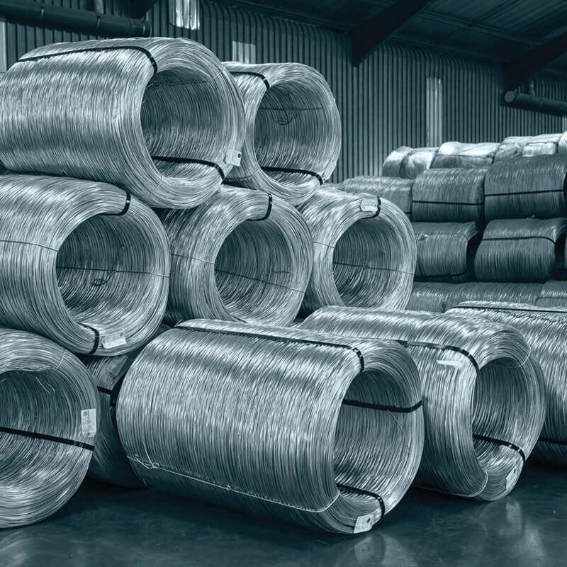
Phase two involved a photoshoot where we sought to bring their values to life through the images we captured of the people and their state-of-the-art manufacturing plant. Our emotive, yet functional images expressed the authenticity of this dynamic business that elevates its people.
We then re-designed the logo, creating a subtly updated version of their existing identity. Without deviating far from the visual appeal their logo had already established, we made a generic font fully customised and distinct. We also crafted a powerful brand icon that would now live alongside, or in some applications apart from the brand wordmark.
We introduced the colour red which commands attention and symbolises passion, excitement, energy and action. The hands-on, team-oriented approach of the members of this family, is the driving force behind the success of this powerful brand- this meant that red, black and white were the right colours to take this business into the future.
Once we had developed the brand identity and photography style guide, we then designed a brand identity guide to ensure consistency. We then collated and designed a product manual that would showcase their products in the form of a printed book.