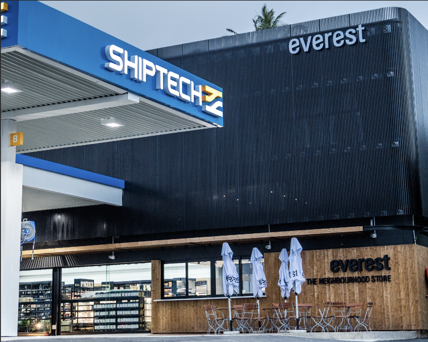
Everest
Everest is a local convenience store, offering a wide range of premium products. From frozen to freshly-prepared meals, baked goods and treats, Everest redefines convenience.
Year:
2021
Services Provided:
Brand Strategy & Positioning
Communications
Visual Identity
Website Design
Digital Marketing
Signage & Packaging Design
The Challenge
Armed with great service and product concepts that emphasise the support of local artisans and businesses, Everest offers a new outlook on community and convenience. The challenge was to craft a visual identity that would capture the true essence of this purpose-driven brand.


The Solution
We conducted a brand DNA workshop, alongside the Everest team to determine why they exist and what makes them different from other convenience outlets. Once we got down to the ‘why’, we gradually began creating and rolling out the uniquely considered visual identity elements, from logo to tagline, colour palette, typography, signage and packaging.


Packaging
Everest’s typography uses a Sans serif font to distinguish the brand and demonstrate a modern and engaging visual appeal. In contrast to the straightforward and simple typography, Everest’s packaging was designed with linocut geometric shapes and patterns, helping the brand stand out as truly South African.